Procrastination, collaboration and the art of brevity.

It was time for a redesign. The old, brochure-style version of my website dated back to 2013: six years of solid service is pretty good going in the digital world. In all honesty, I would have advised clients to update well before that. Somehow, improving one’s own resources always seems to take a back seat versus client projects!
I’ve previously admitted how hard it can be to write about yourself, so I have to acknowledge there was an element of procrastination too!
On the plus side, my new and more contemporary site design called for a significant cull on copy – less to write! Hooray… or maybe not! It’s a mixed blessing. When less has to say more, that small number of words really does need to work for you.
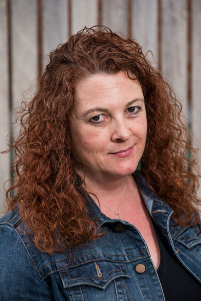
I’ve also had to go out of my comfort zone into the world of graphics and imagery, to choose the photos that enliven the pages. And then there was the terrifying task of creating “dynamic content” in the form of a welcome video and providing personal photos for authenticity.
Is it a good investment when most of my business comes from repeat clients? I do get some cold calls based on a visit to my website. It’s also an important resource for referred clients to check me out and a place to keep a gallery of work examples. I also try to share views with colleagues and customers through this blog, so you know I’m still here!
I hope it works for all these people and purposes. Let me know what you think – and if there’s anything I could change to make it better.
Inspiring resources and people: thank you!
I found Lindsay Kolowich’s hubspot article and infographic very helpful when considering what to include in my new website.
Web designer Susie Tobias at Wise Genius provided excellent counsel and is a WordPress web design expert: she made the website happen!
Susie recommended two libraries of royalty-free photography, which I used for website images: pexels.com and Unsplash.
Peer networks are invaluable when you need a second opinion. I’ve worked with communications expert Fiona Henry on many projects: she gave me great feedback and proofing help.
The Wordsmithy’s brand logo, now headlining its third website iteration, has stood the test of time. Kudos to Kevin Taplin who created it for me ten years ago – coincidentally his design agency TenSevenNine has also just celebrated its tenth birthday!
